TIE-CD versus TIE-95
Where's the point in discussing which version of an ancient game is the better one, you might ask. Well, if I wouldn't still be a fan of TIE Fighter, I wouldn't be in the TIE Corps, besides, people always ask me why I'm hating TIE-95 so much. As I'm growing tired of explaining my all too obvious reasons over and over again, I decided to write it down once and then just post the link. Clever, eh? :P
TIE-95 is the only version of TIE Fighter that is supported by our TAC office, which is of course because it's the only version for which people found out how to mod it. The patch that really excites me still has to be written, though. Besides, there's no reason why testers shouldn't be required to test new missions (as long as they don't need fighter patches) for all versions of TIE, and mark it in the mission compendium. Of course it's more convenient to say "Hey, TIE-95 is the ultimate version of TIE Fighter, just use that one".
Well, but if it's the ultimate version... why does it suck that much?
When I first heard that there is a version of TIE Fighter that runs under Windows and uses 3D hardware, I was quite excited that Lucasarts released this timeless classic in a modern version. "Modern" is of course relative, as it's from 1998. As a result, it was hard to get even back in 2001. I ended up getting the "X-Wing Trilogy" from the UK, a package that includes XWA, XW-95 and TIE-95. I didn't have XWA before, and only the disc version of X-Wing, so it was no bad deal.
However, when I played that so-called "ultimate version" of TIE Fighter, I had to learn that it's a five-minute-job of Totally Games/Lucasarts.
What are we even talking about?
Since we're discussing TIE Fighter versions, we should first clarify which versions there are in the first place. And this can be confusing already, mostly because of LucasArts' sloppiness. There are three versions, but even to this day, some online resources fail to recognize this and only distinguish between two. Let's see why that is.
- TIE Fighter was first released in 1994 on 6 3½" disks and runs on DOS in VGA 320x200. The campaign consists of 7 battles originally, the expansion "Defender of the Empire" adds three more. In the TIE Corps, this version is commonly referred to as "TIE-Disk".
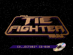
- The game was re-released as "TIE Fighter Collector's CD-ROM" in 1995. It comes on one CD-ROM (obviously) and runs under DOS in VGA 640x480. The campaign consists of 13 battles (the original 7, 3 from "Defenders of the Empire", and 3 more from "Enemies of the Empire", which was, however, never sold under that name as a separate expansion but was only included in the CD edition.) In the TIE Corps, this version is commonly referred to as "TIE-CD".
- The game was then again re-released as "TIE Fighter Collector's CD-ROM" in 1998. It comes on one CD-ROM (obviously) and runs under Windows 95 with the graphics engine of "X-Wing vs. TIE Fighter" (640x480, either software mode or DirectX hardware accelerated). The campaing consists of the same 13 battles as the previous Collector's CD-ROM release. In the TIE Corps, this version is commonly referred to as "TIE-95".
So the problem is obvious: The two releases of 1995 and 1998 have the same goddamn name, despite being very different. One can only speculate why LucasArts thought this was a good idea. My bet is that it was pure laziness. As we will see all throughout this article, not a lot of time or care was put into TIE-95, so even coming up with a new name for it apparently was too much trouble, as it would have required creating a new box art as well as changing the intro cinematics again.
If you want to find information about the game online, this obviously makes things very complicated. I have seen my good share of forum threads were people discussed the "Collector's CD-ROM" and got confused as hell because they did not realize that they were talking about two very different games.
For this reason, the names "TIE-CD" and "TIE-95" are normally used in the TIE Corps. It is important to note, though, that this is not much help to the uninitiated newcomer. Keep in mind that "TIE-CD" was released in '95, while "TIE-95" also comes on CD - and was released in '98 (the 95 refers to Windows 95).
So in short, LucasArts messed it up. And it wasn't by far the only thing they messed up in TIE-95 - we're just getting started.
First steps
As you'd expect from a classic game like TIE Fighter, installing and running it on a modern machine requires some work if you start from the original CDs. You may think it would be a bit easier for TIE-95 than for TIE-CD, but it's not. Both worked fine for Windows 95 and 98, and both stopped working fine when Windows XP came along. From that point onwards, TIE-95 needs a lot of patching while TIE-CD needs a soundcard and gameport emulator. Since Windows 7, a full-fledged DOS emulator like DOSBOX is required.
None of this is a huge problem if you know how to set things up, I just want to point out that TIE-95 doesn't make your life easier just because it's more "modern". The most convenient way to run either game in this day and age (early 2020) is to use the GOG versions. They're not perfect (TIE-95 only runs in software mode, TIE-CD's DOSBOX may require some cpu cycles tweaking depending on your machine), but they're a good starting point and will get you into the pilot seat quickly.
So let's find out where TIE-95 is superior to TIE-CD...
Music
TIE Fighter (classic) really has some cool music, in the cutscenes as well as ingame. It is an original soundtrack, while at the same time it definitely sounds like Star Wars. An orchestral version would be a great great thing, but of course I didn't hope for that in TIE-95... it would just have been far too much effort for a mere relaunch of an old game.
What I did expect, though, was a decent synthesizer recording of the old MIDI tunes. You would expect that Lucasarts had some better sound equipment than average Joe, and still, the squeaky noises that torture your ears during the intro are clearly the product of a standard FM synthesis. They probably played the old TIE Fighter music on the oldest Sound Blaster they could find while pressing a cheap microphone against the speakers.
Question is, why did they scrap the MIDI system in the first place when the result is that horrible? Even I, who knows zero about making music, can produce better results on a wavetable emulator. And don't argue with the age of the game, wavetables aren't exactly a new invention, you know, not even in the consumer market. Besides, with the "Lucasarts Soundtrack CD" and the CD version of Monkey Island, the people at Lucasarts have proven that they can make something out of those MIDI tunes - if they want to.
While the very bad recording of the intro music is a big disappointment, it gets even worse in the later game, as it turns out that most of the old soundtrack has been scrapped alltogether. Recordings of the old MIDIs (in the same horrible quality like the intro music) can be heard in the training simulator, the combat chamber and the cutscenes. The other themes, like the ones of the main hall, the tech room and the briefings, have been replaced by some strange humming and beeping noises. Is that supposed to be a substitute for the original cool music? Well, those guys at TG really must hate their fans a lot.
Comparison 2: Music from Main Hall, Tech Room, Training Simulator, Combat Chamber, and Mission Briefing
The series of disappointments regarding music still doesn't end when the flying part begins, quite the contrary.
In TIE Disk and TIE-CD, there was dynamic music that changed according to the current situation. So for example, if some new enemy fighters arrived, you knew it before you had seen them. This "Interactive Music Streaming Engine", or iMUSE, did not make it into TIE-95. Instead, we're listening to a mix of the standard Star Wars score. Although it has the much-appraised CD-quality, it has nothing to do with the game at all and is just some boring background music.
The Imperial March as the "mission accomplished"-tune is quite nice - but while that march is a cool piece of music, it's a pitty they've scrapped the original victory melody from TIE-CD.
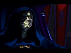
When a mission is lost, we hear (with some astonishment) the Emperor's theme. While this choice doesn't make any sense at all, considering that the player was actually fighting for the Emperor, noticing that would have required one of the developers to actually care about the project. So I'm obviously demanding too much here.
And there is yet another annoying aspect of the CD tracks: when the game switches between them, it freezes for a second, then runs at greater pace for a sec to "catch up" again. If you are a high score hunter, and such a hickup hits you at the wrong moment, this can really ruin your day, so you'll have no option than switching off the music for good.
Sound
There are not many differences between the sounds of TIE-CD and TIE-95... I can only think of two. In both of them, TIE-95 loses.
The first is about the engine noises. In TIE-CD, there just are none. So you could think that adding them to TIE-95 would be an improvement - until you have played for about an hour. Then you are ready to pierce your ears with red-hot needles just to get rid of that annoying high-pitched noise again. Fortunately, there are less drastic methods, like editing SFXDOE.LFD. Oh, sweet silence!
If you work for Lucasarts, you think that this is a really lovely sound you'd like to hear all the time while playing:
The second difference concerns the voice files. In TIE-95, these have a reduced quality (11025 Hz at 88 kbps instead of 22222 Hz at 177 kbps in TIE-CD) and they have a more than lame echo effect added to them. It's not like the difference is unbearably terrible, but the fact remains: they actually downgraded the voice quality.
It is strange that the voice files seem to be one of the very few parts that the developers actually put some work into. Looking at the result of that, though, I guess one has to be thankful that they did the rest of the game in a greater rush. Someone should have told them that the point of making an upgraded version of a game is improving it.
Graphics
Now we have finally reached the aspect where the newer version of TIE Fighter is supposed to score - and entirely fails to do so.
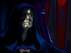
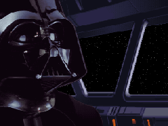
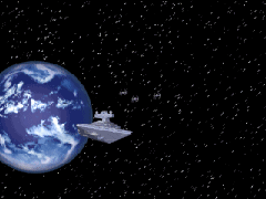
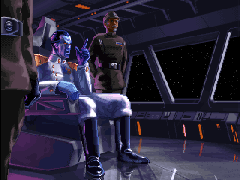
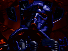
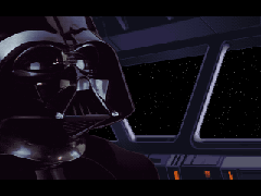
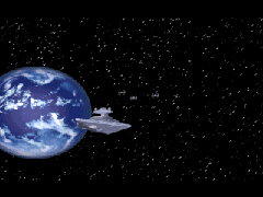
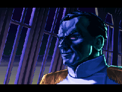
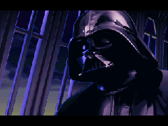
It starts with the intro. While there were new scenes to be seen when TIE Disk was upgraded to TIE-CD, TIE-95 has absolutely nothing new. I suspect that's the reason why they didn't even invent a new name (instead of "TIE Fighter Collector's CD-ROM") to make the distinction between TIE-CD and TIE-95 easier. It would have meant putting work into altering the intro - god forbid!
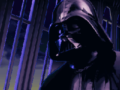
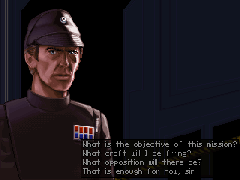
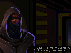
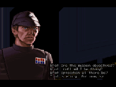
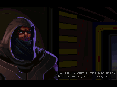
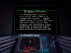
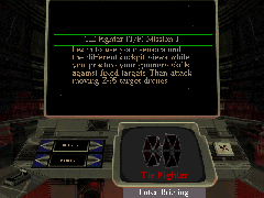
However, the actual content of the intro being unchanged isn't even the bad part yet. The bad part is that it is squeezed horizontally - everything looks flattened. Unfortunately, this is not only for the intro, but each and every cutscene, the launching sequences and the briefing screens.
How could that happen? Well, the resolution of the original TIE Fighter game was 320*200. This means that all the 2D screens, including cutscenes and menus, have that resolution. TIE-CD, while upgrading to 640*480 in the 3D (flight) mode, kept that old 320*200 resolution for the 2D parts, so everything still looks as it should. TIE-95, on the other hand, runs on 640*480 all the time. While that is theoretically a good thing, the rescaling of the old material is done very poorly. If there was a real problem in stretching the 320*200 material to full 640*480, or if the programmers were just too lazy to do it, that remains a mystery. For some reason, however, TIE-95 scales up the stuff by factor 2, that is, to 640*400, and adds black bars on top and bottom - which is obviously the dumbest idea since Greedo shooting first, as it leads to the described distortion effects.
One more time (and, sad enough, by far not for the last time), one has to wonder how someone can so spectacularly miss the meaning of the word "update" by making the new version worse than the old one.
Comparison 4: Looks like some of the "improvements" in TIE-95 have fallen really flat.
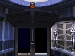
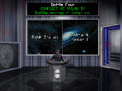
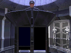
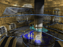
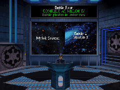
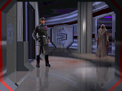
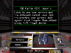
There are a few screens without this effect: Those who have been redone specially for TIE-95, as these have a native resolution of 640*480. These are the registration desk, the main hall, the battle selection screen, the briefing and the debriefing room (see pictures below).
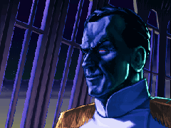
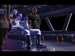
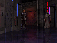
Unfortunately, not even all of these new graphics look better than the old ones. Looking at the new briefing screen, one has to wonder where the advantage of a higher resolution lies when at the same time a palette is used that hardly has any colours but shades of purple. The poor briefing officer looks like he's suffering from leprosy. And his uniform, too. When you click on him, he looks normal again... apart from the strange distortion, for this picture is a mis-sized original again.
The debriefing screen isn't quite as bad (at least a decent palette was used), but still worse than the original, where the lighting is much nicer.
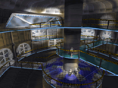
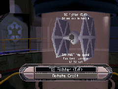
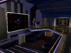
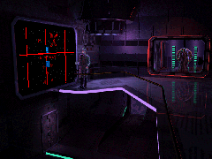
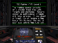
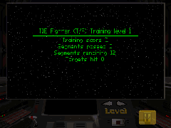
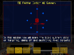
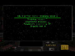
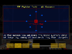
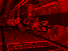
As if this whole graphical mess wasn't already bad enough, it becomes outright ridiculous when old and new versions are wildly mixed. For example, if you enter the combat chamber, you see they made a new interface. Choosing a mission calls the mission map - squeezed, and with the old interface showing beneath. Looks like somebody's motivation was really, really low. Same thing happens with the training simulator, by the way.
Comparison 7: Training Simulator and Combat Chamber. Hey, they've given them a facelift - or did they?
OK, the 1995 pics have the higher resolution. But the 1990 ones have their benefits, too. For one, they are used consistently. For two, designers knew how to spell "TIE Fighter".
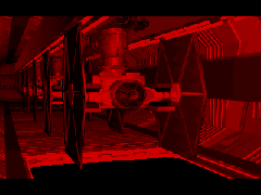
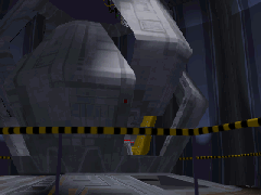
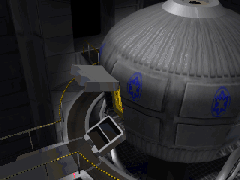
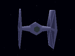
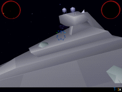
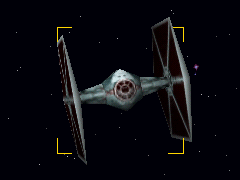
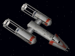
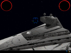
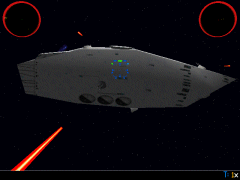
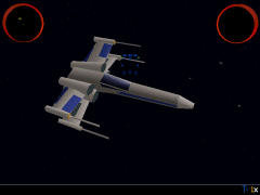
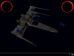
The main thing that's supposed to make TIE-95 superior to TIE-CD is the 3D ingame graphics, of course. TIE-95 uses a similar engine like XvT. Although it's not exactly overwhelming, it does look better than the very old TIE-CD engine. The resolution is still 640*480 (as in TIE-CD) and the models are still pretty primitive, but they have textures now. These are very low-detailed, though, so that only small objects, like fighters, profit from them. Larger stuff, like Star Destroyers, look good from far, but far from good. You shouldn't come too close or they become a blurry mess.
TIE-95 surely profits from the new ingame graphics. However, this is the first point it scores in this entire comparison - not nearly enough.
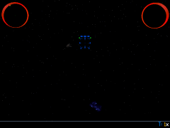
Besides, you have to consider that the textures also increase the difficulty, because the textured (and therefore somewhat darker) objects are harder to see and to hit. The new target boxes, which loosely surround selected objects instead of highlighting the objects themselves (as it was in TIE-CD) provide no aid in aiming at all.
Comparison 9: Some textures are rather dark and make it more difficult to make out enemy ships.
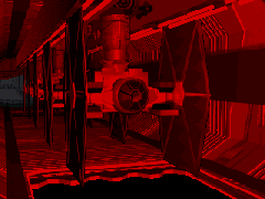
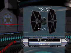
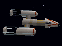
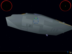
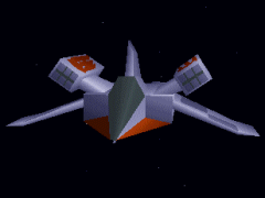
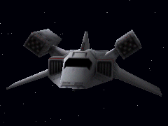
And no, we're still not done with the ranting before having mentioned the new craft models. First, there's the Missile Boat. OK, that's a ridiculous craft in every version of TIE, with its stupid single laser and a warhead capacity that's higher than that of any capital ship. However, at least it looked sharp in TIE-CD. In TIE-95, it looks like a toy-Gunboat with cut-off wings. Of course, the makers didn't change its appearance in the launching sequence, that might have caused work. Apart from the squeezing effect, it's the old Missile Boat there. But strange how somewhere between leaving the hangar and arriving on the battlefield, the Missile Boat transforms from a cool looking fighter to a pathetic piece of junk.
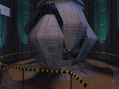
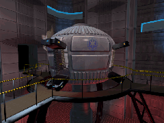
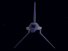
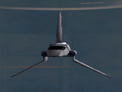
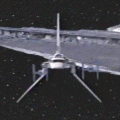
Another craft that has suffered a similar fate is the shuttle. Why the designers thought the angle of its wings needed adjustment beats me. A comparison between the shuttle as seen in the movies, as seen in TIE-CD and as seen in TIE-95 clearly shows that the wings in TIE-CD are correct and the wings in TIE-95 are wrong. It's strange really, as they actually modelled the hull shape more accurately than with the TIE-CD model. It's just the wings that are messed up.
Comparison 11: Shuttle geometry
Under the hood
As TIE-95 fails to come up with good (let alone improved) music and modern graphics, you could hope that there are at least some technical improvements "under the hood" of the system. Nada.
TIE-95 still has a craft limit of 32. Sometimes people say this would be an improvement over TIE-CD, but that is false. TIE-CD already had 32, too, while TIE Disk's limit was at 28. So absolutely no improvement has been made on this field by TIE-95.
Then there's the problem of the inflight films. Theoretically, TIE Fighter lets you record how you play a mission and you can watch it later in the film room. As you can share these films with others, it would be a valuable thing for competitions, for squad mates to help each other out. Unfortunately, these films don't work on faster machines, because they run too fast, and out of synchronization. This is a problem that's kind of predestined for a modern, so called "ultimate" version to fix. Did they? Of course not. Would have smelled like work. Inflight recordings in TIE-95 are still useless.
TIE-95 even introduced a new bug to the game that didn't exist in TIE-CD, which is the problem that Imperial Star Destroyers cannot fire their lasers. A fix for that bug has been released a long time ago, but still, it reveals a lot about the quality of the testing that went into TIE-95 when the pride of the imperial fleet has zero firepower because some doofus mounted its guns on the wrong side of the hull.
Bottom line
OK, let's see again. TIE-95 has
- not even the slightest hint of new game content,
- lower joystick precision,
- either ruined or replaced the original brilliant game music,
- decreased sound quality,
- ruined each and every cutscene by squeezing it into a wrong aspect ratio,
- a handful of new 2D screens, of which even the good looking ones don't blend in with the rest of the game at all,
- two craft models replaced by crappier versions,
- textures.
So, the only two real achievements of the game are, first, adding some low-res-textures, and second, making some people think that it is a good game and a worthy "ultimate version" of TIE Fighter, while it's in fact the worst re-release of a classic game that was ever seen.
iMuse and the names of the games that are mentioned are trademarks or registered trademarks of LucasArts Entertainment Company LLC.
